
How to reduce cart abandonment rate and improve the checkout performance of your eCommerce

If you have an e-commerce website there is a big chance that you have already heard about “cart abandonment” or how you should improve your “cart abandonment rate”. The truth is, no one creates an online shop wishing that people leave without purchasing, right? But within the latest user behaviour reports we’ve noticed cart abandonment becoming increasingly common.
According to a Baymard Institute report, the average cart abandonment rate is 70.19%, which means that 7 out of 10 visitors on your website will leave without finishing their purchase. With that said, it’s important to have a look at the impact of it. Another report, from Forrester, claims that the amount of annual sales revenue lost to digital shopping cart abandonment amounts to a whopping $18 billion.
The numbers might be scary, but understanding this user behaviour and knowing how to overcome it can make a huge difference to your business. It is completely possible to improve and reduce these numbers. When focusing on the user experience, you can bring benefits not only to the website experience itself but also to the conversion rate, your brand authority and trustworthiness.
Below is a breakdown of what you will find in this post:
- What is cart abandonment?
- What are the main issues causing users to abandon their products at checkout?
- What are the negative effects of shopping cart abandonment?
- What is the checkout abandonment rate and how is it different from the cart abandonment?
- What is the average cart abandonment rate?
- What are good, average and bad values for cart and checkout abonnement rates?
- How can you analyse the status of your checkout process and your cart abandonment rate?
- How to reduce your shopping cart abandonment rate?
- What other problems in the checkout process can impact the conversion of your ecommerce store?
What is cart abandonment?
Cart abandonment is when users add items to their online cart and then leave your website without completing the purchase. This behaviour is often monitored as it is an indicator of potential issues within the purchase journey, such as user experience or customer decision-making barriers.
The cart abandonment rate is the metric we use to understand the percentage of users that show this behaviour. It is calculated by dividing the total number of completed transactions by the total number of opened carts. This figure is important in understanding how your business is performing and if there is any room for improvement.
With that said, it is important to pay attention to some details in your cart and checkout journey such as the UI design, time to complete the purchase, how easy the checkout process is, shipping and taxes and even your website’s policies. They can all contribute to users abandoning their carts.
What is the checkout abandonment rate and how is it different from cart abandonment?
Besides being part of the same user journey, the checkout abandonment rate and the cart abandonment rate are different things. What differentiates them is where your user drops off from your website:
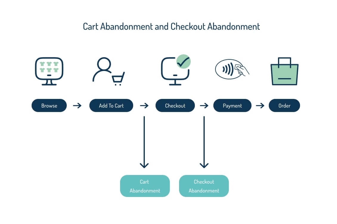
When your user is dropping out at the cart stage, you should pay attention to details such as shipping costs, delivery time, the complexity you’re demanding to go to the next step (checkout) and if there are any issues with your cart design.
And when your user is dropping out on the checkout page, you should pay more attention to:
- Errors that could have occurred with payment methods, redirects, page loading etc.
- if the payment gateway or provided methods are working properly
- the buttons – are they clear and usable?
- if the data collection fields required to complete the purchase are not too extensive, and only include the necessary details
Once your user clicks to “go to checkout” they are more invested in finishing the purchase, so you must be more detail oriented when the drop occurs here.
What are the main issues causing users to abandon their products at the checkout?
There are multiple reasons why your users can leave the checkout process. According to a Baymard Institute research, these are the main reasons:
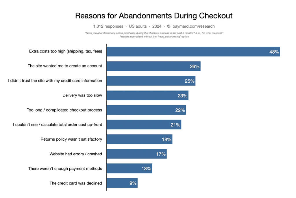
Another possible reason for this type of behavior can be price comparison or window shopping, which means that the user was only browsing the website and had no real intention to buy. In this case, it is extremely important to build a community with your customers, this way you can rely on their brand loyalty and reduce abandonment rate.
What are the negative effects of shopping cart abandonment?
You know what cart abandonment is, and the reasons why people leave the checkout. You are probably wondering why it matters, or how to improve the checkout experience, right?
- The first and most obvious is the loss of sales opportunities. When a user leaves your cart/checkout process you are leaving money on the table, directly impacting your revenue. This can also have a more indirect impact through:
-
- Reduced revenue per visitor, which promotes a lower customer lifetime value
- A lower customer lifetime value will make it more difficult to estimate your customer acquisition costs and plan your marketing budget accurately
- Creating misleading website analytics data, such as data suggesting that a particular product page isn’t converting as well as it should or signalling exit intent when there was initially an intent to buy
- You may be losing customers to your competitors, so it’s important to address the main cause of your abandonment rate to understand how you can be the first choice for your audience. That can come from the user experience of your cart, the benefits your store provides, prices and more.
- You may be losing an opportunity to create some engagement with your audience. Engagement leads to loyalty and loyal customers will always return (even if they left their carts at some point of the journey).
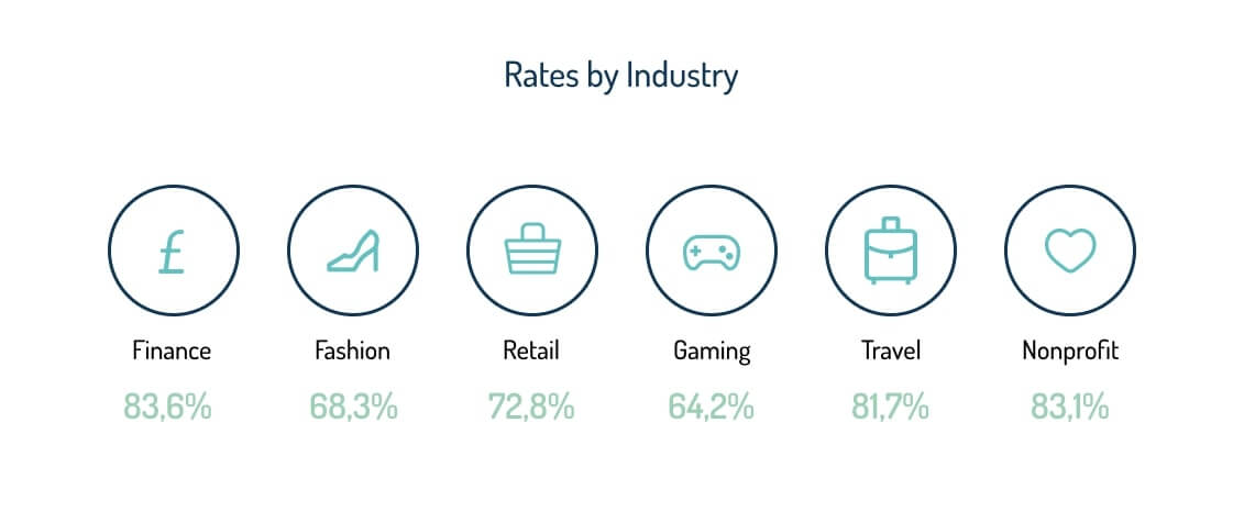
What is the average cart abandonment rate?
The overall average checkout abandonment rate, regardless of industry, is 70.19%. But it is important to consider your industry, since these rates will differ. To assess whether your rates are good or not, compare with your known competitors using Industries reports:
What are good, average and bad values for cart and checkout abandonment rates?
According to Agency Analytics, a good average cart abandonment rate typically ranges between 60% and 70%. While that might seem high, it’s generally accepted in the ecommerce industry because window shoppers often use carts as a form of wish list or bookmarks. Rates in this range indicate that checkout processes and customer experiences are relatively streamlined.
A cart abandonment rate that exceeds 80% should be considered a red flag. Such a high percentage usually suggests multiple friction points in the customer journey, from complicated checkout processes to unexpected costs like shipping and taxes.
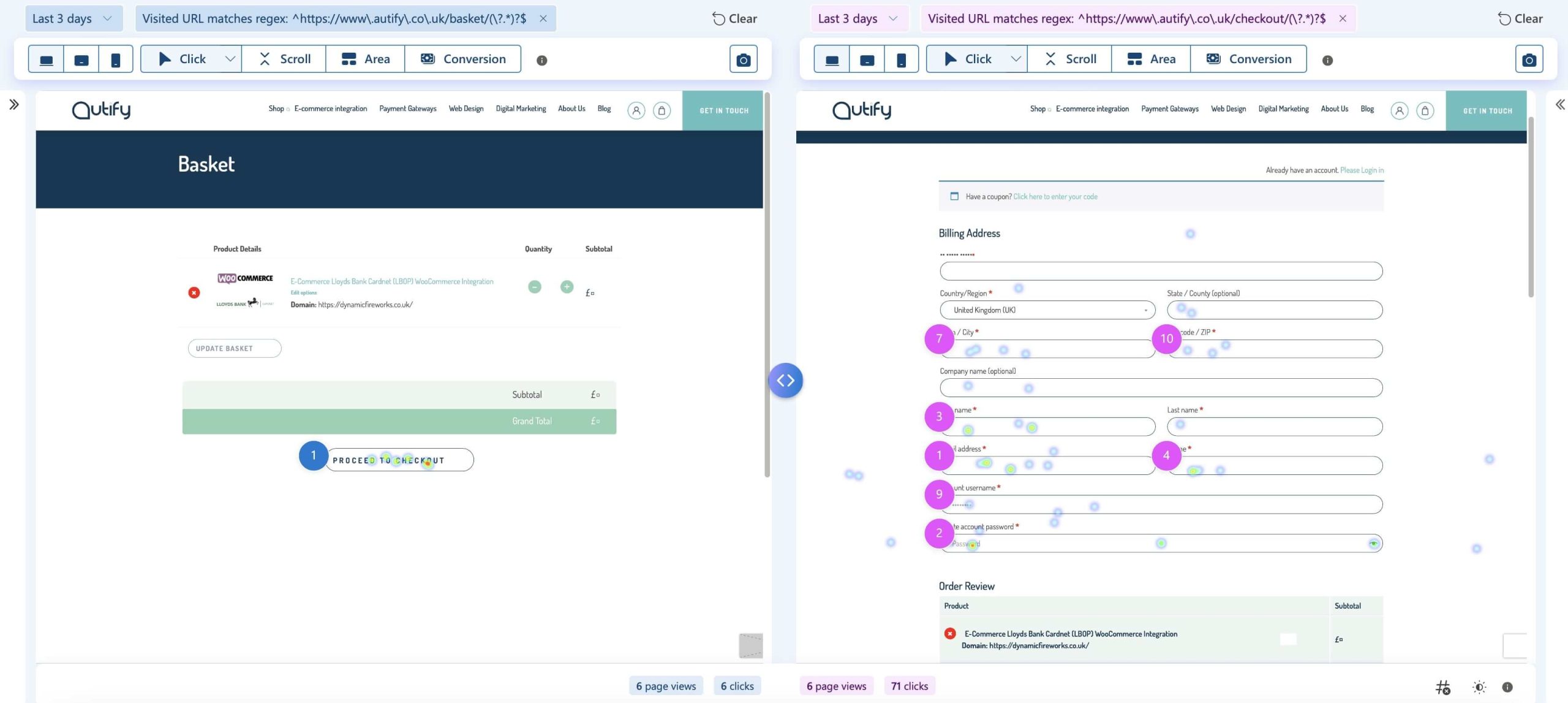
How can you analyse the status of your checkout process and your cart abandonment rate?
Cart abandonment rate can be analysed alongside other key performance indicators. For example, Google Analytics 4 (GA4) can help you see data on users who have taken the first step in the checkout process – the checkout data point is where to look.
To add as a comment: Google Analytics 4 is a great tool that you can use to evaluate the performance of your ecommerce store and its checkout process. By accessing the “Explore” section from the main menu, you can create a “Funnel Exploration Report” focused on the main events tracked in the checkout process on your website. Select the “Standard Funnel” visualisation, add the main checkout steps (Add to Cart, Begin Checkout and Purchase) and wait for the report to populate. It will report the number of users performing each action in the purchase process and the completion and abandonment rate for each step. As for every custom report in GA4, it is possible to filter by traffic source and user segments and to compare different segments.

How to reduce your shopping cart abandonment rate
Now you know what cart abandonment rate is, the difference between cart abandonment and checkout abandonment, the reasons for this kind of behaviour and the rates you should be looking for and how to analyse it. Here you will find advice on how to reduce your shopping cart abandonment rate:
-
Monitor and always improve the mobile experience
To remove friction and improve UX, focus on how the checkout flow looks and functions on a smaller, mobile screen and remember that simplicity and speed are key. Prioritise mobile responsiveness, intuitive navigation, and streamlined forms to eliminate friction. Regularly test your website across various devices and screen sizes to identify and address any usability issues promptly.

-
Reduce complexity and minimise clicks through the checkout process
Complexity and excessive clicks during checkout can deter customers from finishing their purchases. Simplify the checkout process by minimising form fields, offering guest checkout options, and implementing address auto-fill features. Don’t make your user fill forms with unnecessary information, think about a checkout page functional and quick to finish.
Each additional step presents an opportunity for abandonment, so strive for efficiency without compromising essential information collection and your user’s precious time.

-
Pay attention to your costs and fees
Hidden costs and unexpected fees are significant contributors to cart abandonment. Be transparent about shipping fees, taxes, and any additional charges early in the checkout process. Consider offering shipping calculators or providing clear explanations of pricing policies to build trust. Research by Nielsen Norman group explains how users react to different ways taxes and fees are displayed, so use this as a guide to improve your layout.
In terms of fees and taxes, you can also compare prices to competitors as this will minimise or extend any room for competitive edge and give you an idea of customer expectations.

-
Increase trust in your checkout process
Establishing trust during checkout is crucial for securing conversions. Display trust badges and security certifications prominently to reassure shoppers about the safety and reliability of their transaction. Incorporate secure payment gateways and encryption protocols to safeguard sensitive information and instil confidence in your checkout process.

-
Pay attention to your delivery time offers
In today’s fast-paced digital landscape, prompt delivery is a key differentiator for online retailers. Clearly communicate delivery timelines and offer expedited shipping options for time-sensitive purchases. Implement order tracking functionalities to keep customers informed about their shipments and anticipated delivery dates, enhancing post-purchase satisfaction and loyalty.


-
Provide a wide range of payment options
In addition to credit and debit cards, think about integrating alternative payment solutions such as digital wallets, buy now and pay later options and financing. Providing flexibility in payment options not only accommodates various consumer preferences but also reduces barriers to completing transactions.
-
Reduce errors and slow loading times
Technical issues can interrupt a purchase. Monitoring site performance on a regular basis and addressing any glitches promptly are key to creating a smooth customer experience.
-
Follow up with customers who abandoned their cart
Create email marketing and retargeting campaigns to re-engage customers who abandon their carts. Send personalised follow-up emails reminding users of their abandoned items, offering incentives like discounts or free shipping to encourage them to complete their purchase. You can also consider dynamic retargeting ads across social media platforms and display networks to recapture lost sales and drive conversions.

What other problems in the checkout process can impact conversions on your ecommerce website?
Other issues related to UX/UI design can cause a bad experience during the checkout process, which can also affect the conversion and your cart abandonment rates. Let’s review them and learn how to overcome them:
-
Headers and Footers are not minimised in the checkout page leading to user distraction
It’s important to prevent any distractions on the checkout page, so the user can finish their task (the purchase) without leaving the page. A good way to keep the user focused is to remove the core header and footer navigation of the page. A user’s full attention should remain on the checkout. You can swap the header for the delivery information link, which should open within a lightbox. Trust signals, such as “secure payment gateway”, are a great way to build the trust of the user and can be placed in the header or footer.

-
No guest checkout option
The guest checkout allows users to make an online purchase without the need to create an account. They’ll simply enter their contact and card details to complete the transaction. An ecommerce guest checkout page won’t have any extra fields to fill in, such as account names and passwords, and their details won’t be stored in your database.
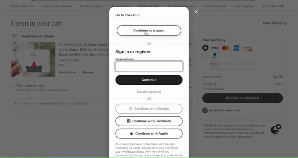
The guest checkout can:
- Encourage first-time buyers with a faster checkout process
- Optimise conversion rates by removing a step in the checkout process.
- Encourage buyers who might be on the fence about making a purchase, because they don’t need to commit to an account.
It’s good practice in UX to allow users to finish their purchases with a guest checkout option.
-
The cart is not clear or functional so users get frustrated and leave
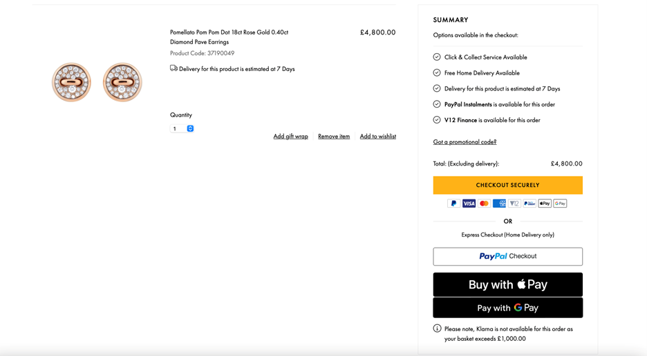
We’ve explained how complexity and unnecessary clicks and steps in the cart and checkout journey can impact abandonment. Another interesting thing to note is how visually your cart also needs to be as clear as possible to convince your customer to continue with the purchase. A good practice cart and checkout design should:
- Allow users to edit quantity or remove products from the cart – It may seem obvious, but sometimes the edit/remove options are missed, causing users to leave the page to go back and make changes – whether or not they make these changes and return is a different story! So, offer flexibility and control so users can procced to the next step (checkout) with ease and without distraction.

- Display progress bars – this is a wonderful UI tool that shows users how many more steps are left. This creates a sense of momentum that reduces the likelihood of someone dropping off due to a never-ending checkout process. A nearly completed progress bar also provides visual reinforcement for shoppers to proceed with their purchase because they can see how much they’ve already invested.

-
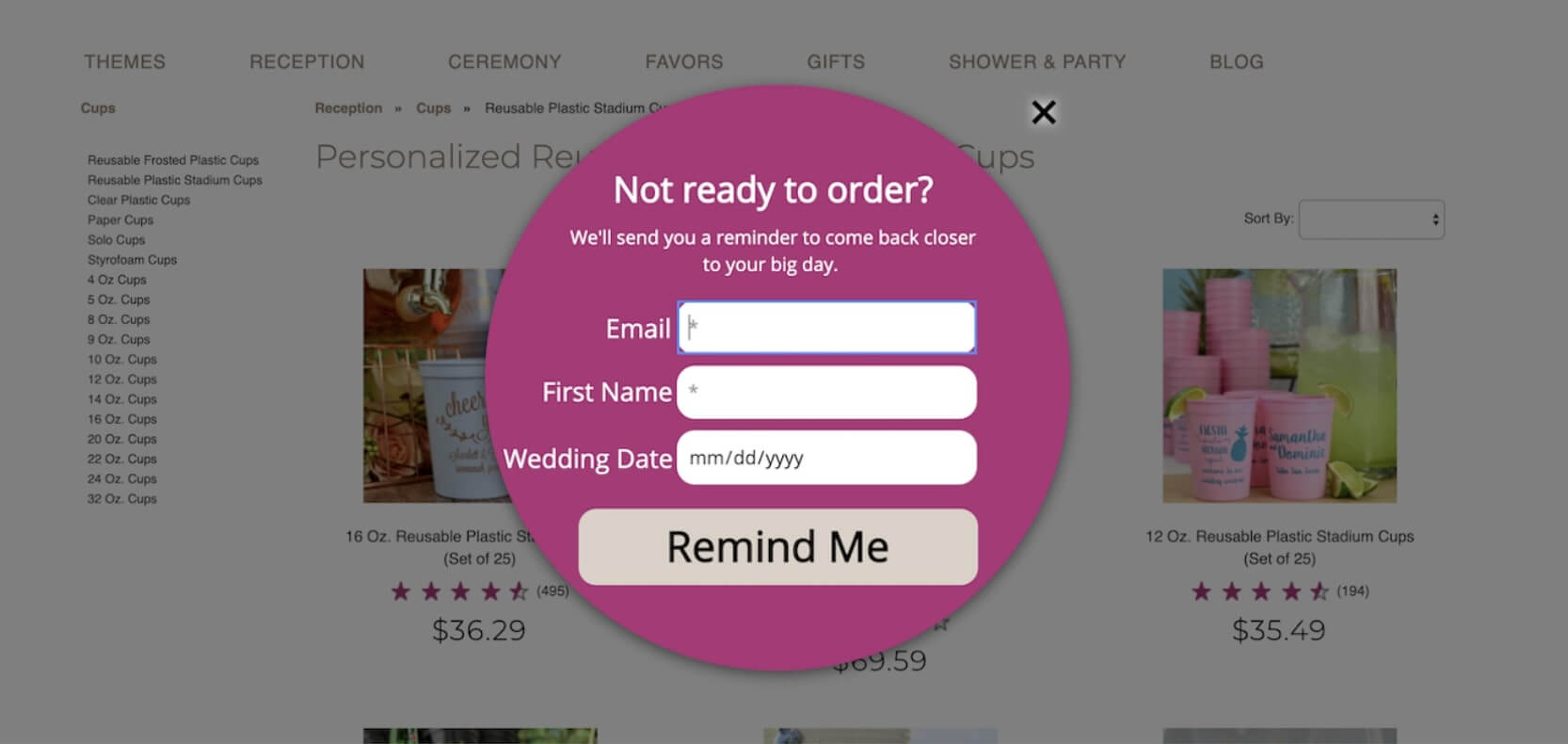
No attempt to convince your users to stay when they’re leaving
When design and marketing go hand in hand, it is impossible not to succeed in your goals as a retailer. Thinking of the user journey, there are some UX/UI features that you can add to your website that together with marketing strategies, such as e-mail marketing and retargeting ads, can help you recover lost customers. For example:
- Exit pop-ups: a cart abandonment popup is a type of exit-intent popup that surfaces when a site visitor has item(s) in their cart but attempts to leave without completing the purchase. The goal? To encourage people to complete checkout before they leave.

You can use incentive strategies to keep your users interested, such as offering a discount, giving the user the option to save their cart before leaving the page, redirecting users to a personal consultation… The sky is the limit when it comes to exit pop-ups strategies for retention.
- Wishlist: A Save for Later feature, also known as a “Wishlist”, can prevent users from discarding items that they won’t purchase right away. However, if Save for Later leads to a lengthy or confusing process, it will either be ignored, or will derail the checkout for the current purchase. According to Nielsen Norman group research, an effective Save for Later feature in a cart must be:
- Discoverable (users must be able to see it without seeking it out)
- Clearly labelled (with information as to what exactly it will do)
- Transparent and easy to use (ideally the label sets expectations with the user that the feature is easy to use)
- Low effort (users won’t need to register or name their list to save an item)

Conclusion
Reducing shopping cart abandonment rates requires a holistic approach that prioritises user experience, transparency, trust, and convenience throughout the checkout process. By addressing common pain points such as hidden costs, cumbersome checkout flows, and a lack of trust signals, businesses can optimise their e-commerce platforms to maximise conversions and revenue.
If you find yourself struggling with high cart abandonment rates or need assistance in optimising your checkout process, don’t hesitate to contact our team! We are more than ready to help you.